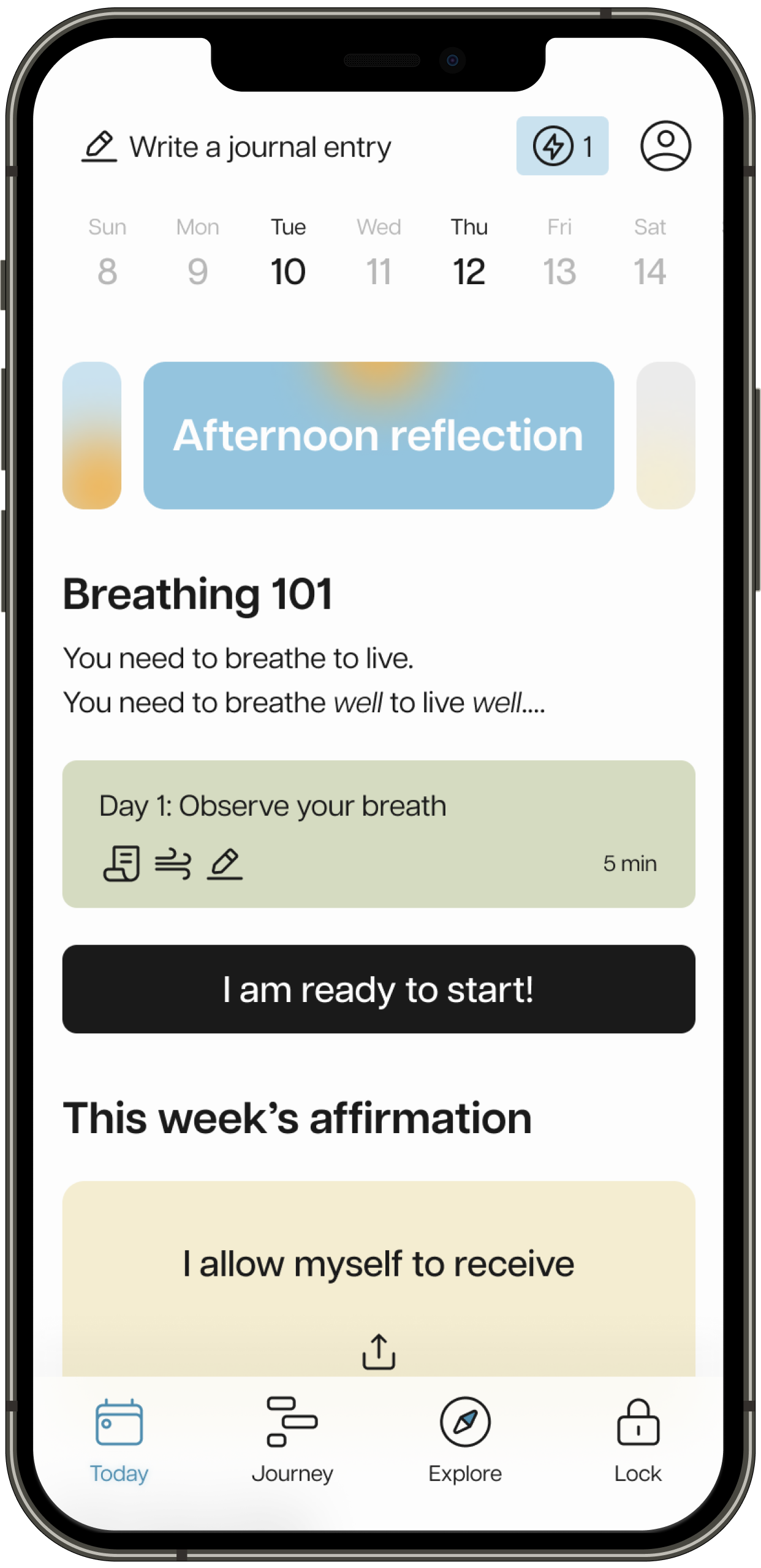
Inner Workout
Build bite-sized self-care into your day. Breathwork, meditations & screen-time boundaries.
Process
I created roadmap to ensure a transparent workflow. Using it, we were able to schedule user testings in advance and make sure every step was on time. The app took 4 sprints (8 weeks) in total.
Sprint 1

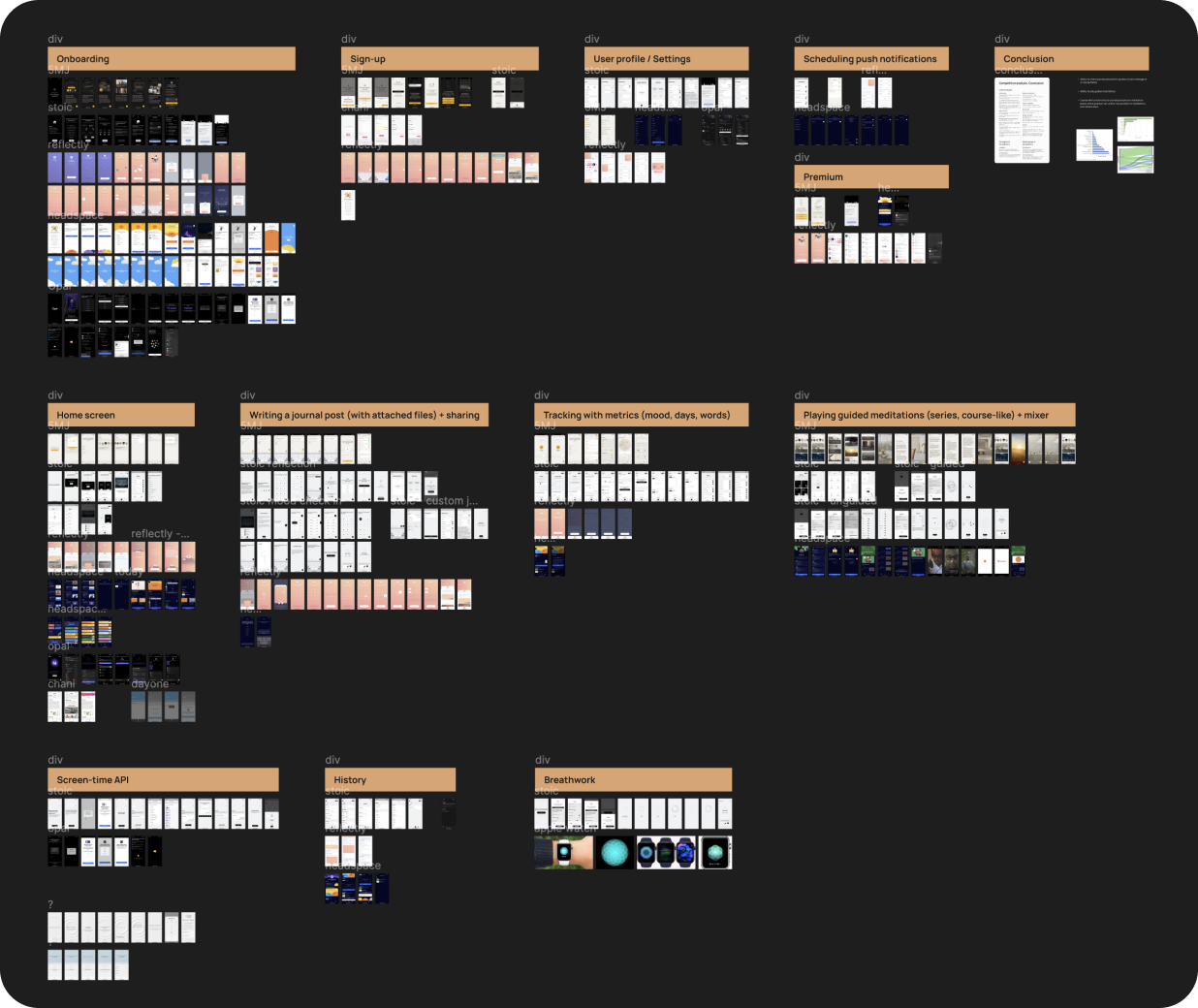
Competitive analysis
I analysed several competitors and highlighted their advantages and weaknesses. As a result, we updated feature-list and got insights for 2.0 version.
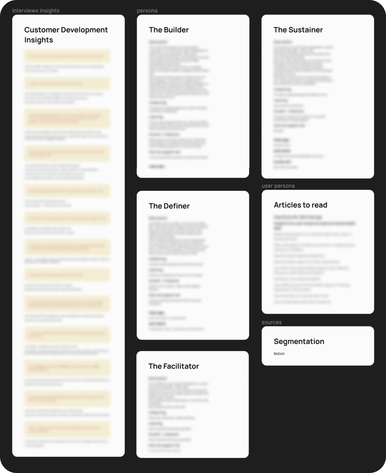
Customer Development
I analysed 17 interviews with Target audience and highlighted useful insights. Self-care related articles helped understand this specific industry and our user persona.
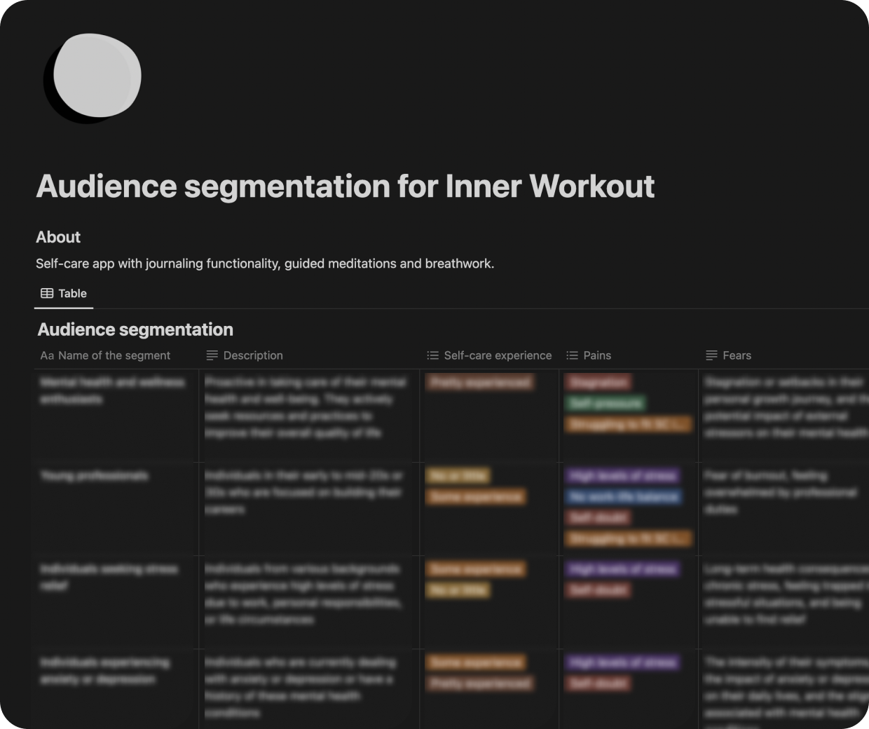
Audience segmentation
To understand Target Audience, their motivation, fears and goals, I created Audience segmentation. Using this document, I could write User stories for every step of Userflow.
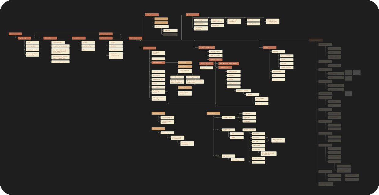
App map
This map helped not only see the whole app but to plan how to design wireframes and what to start with.
Sprint 2

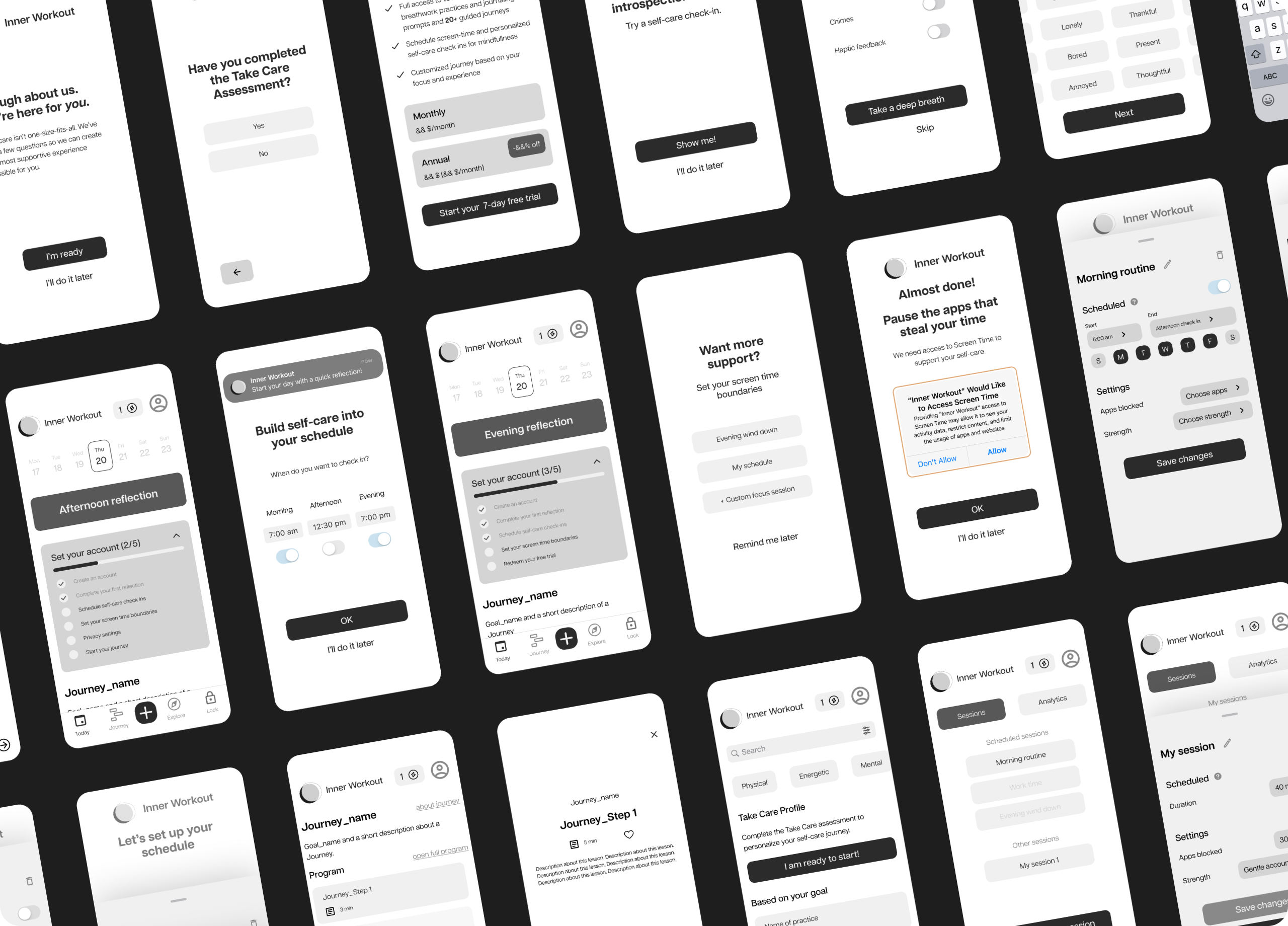
Lo-fi wireframes
I created 100+ Lo-fidelity wireframes and made an interactive prototype to test them on users and gather their feedback.
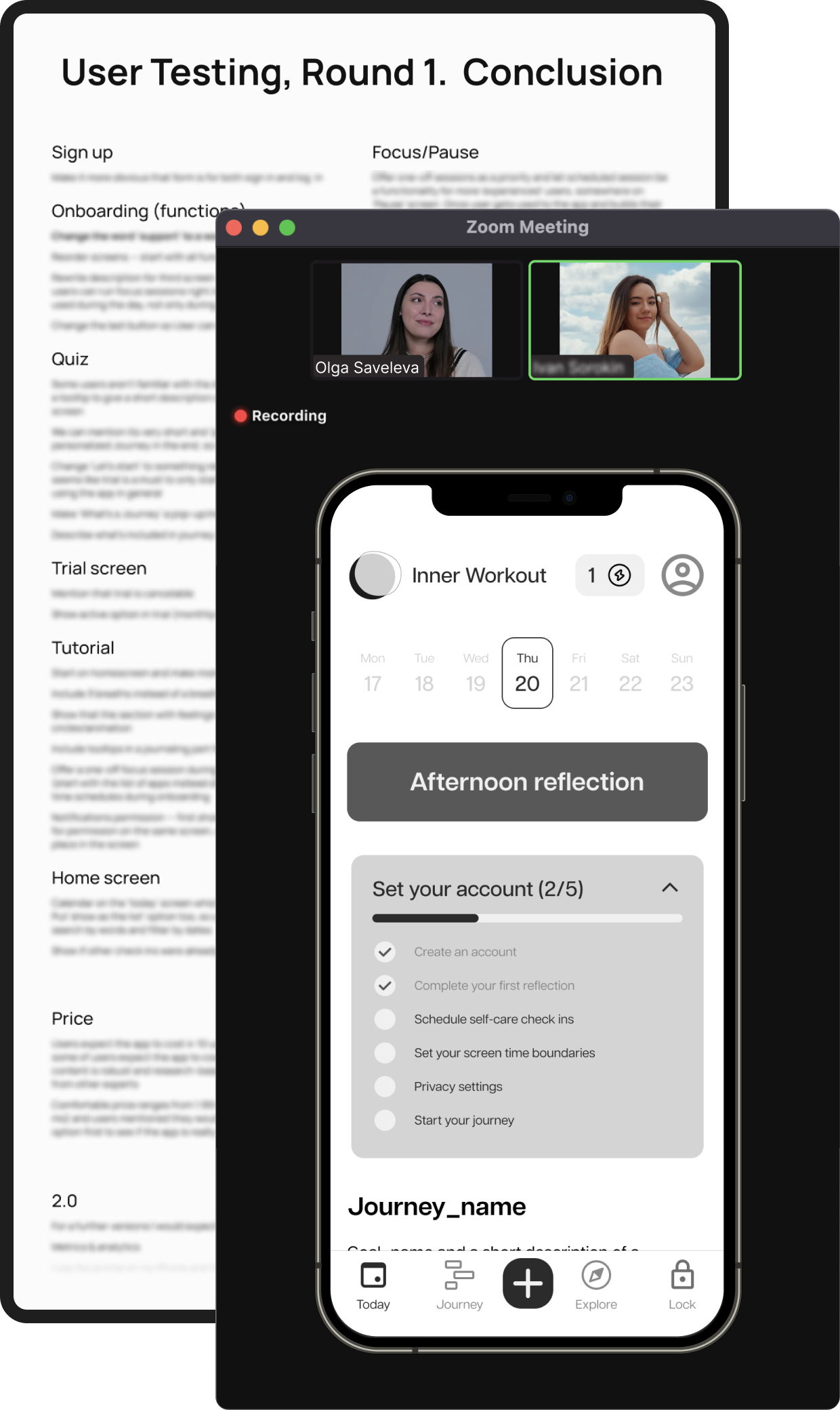
User Testing, Round 1
Gathered feedback from 6 users, discussed and updated feature-list according to it. The main focus transformed from unusual feature (Screen-time boundaries) to more convenient one to make app beginner-friendly.
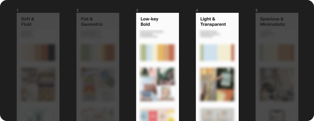
Moodboard
I created 5 moodboards with different styles to choose from. In the end, we decided to mix two of them together.
Sprint 3


Design concept
Work on visual part of the design started with choosing color scheme and making design concept.
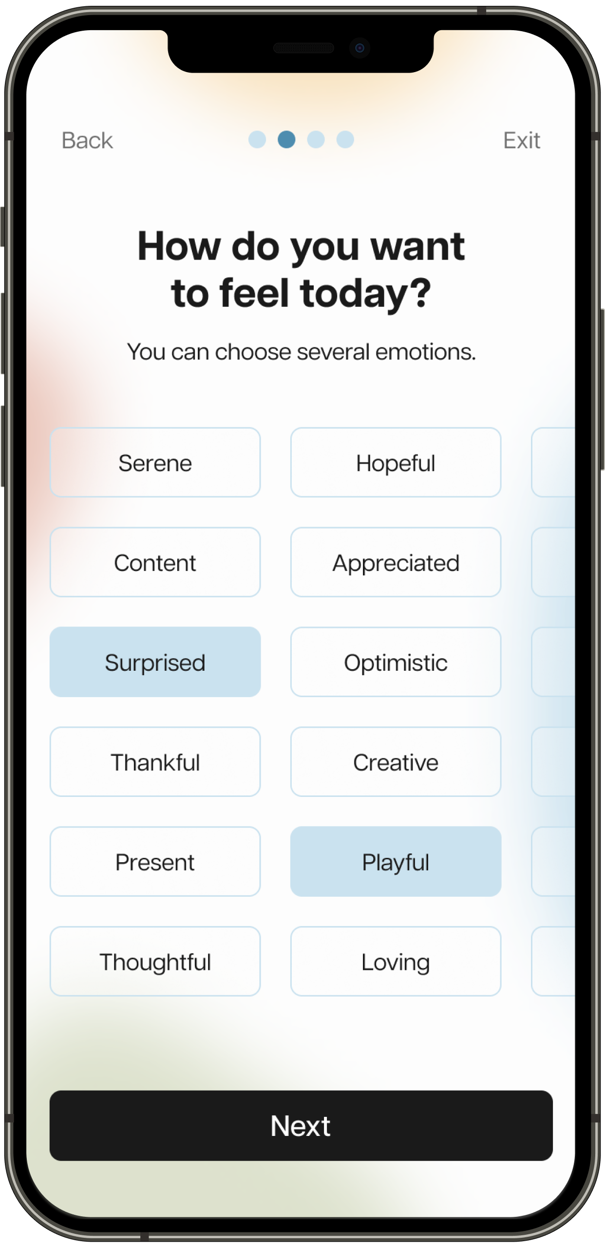
UI Design
I transformed Lo-fi wireframes to High-fidelity layouts. Over 150 screens were created.
Sprint 4

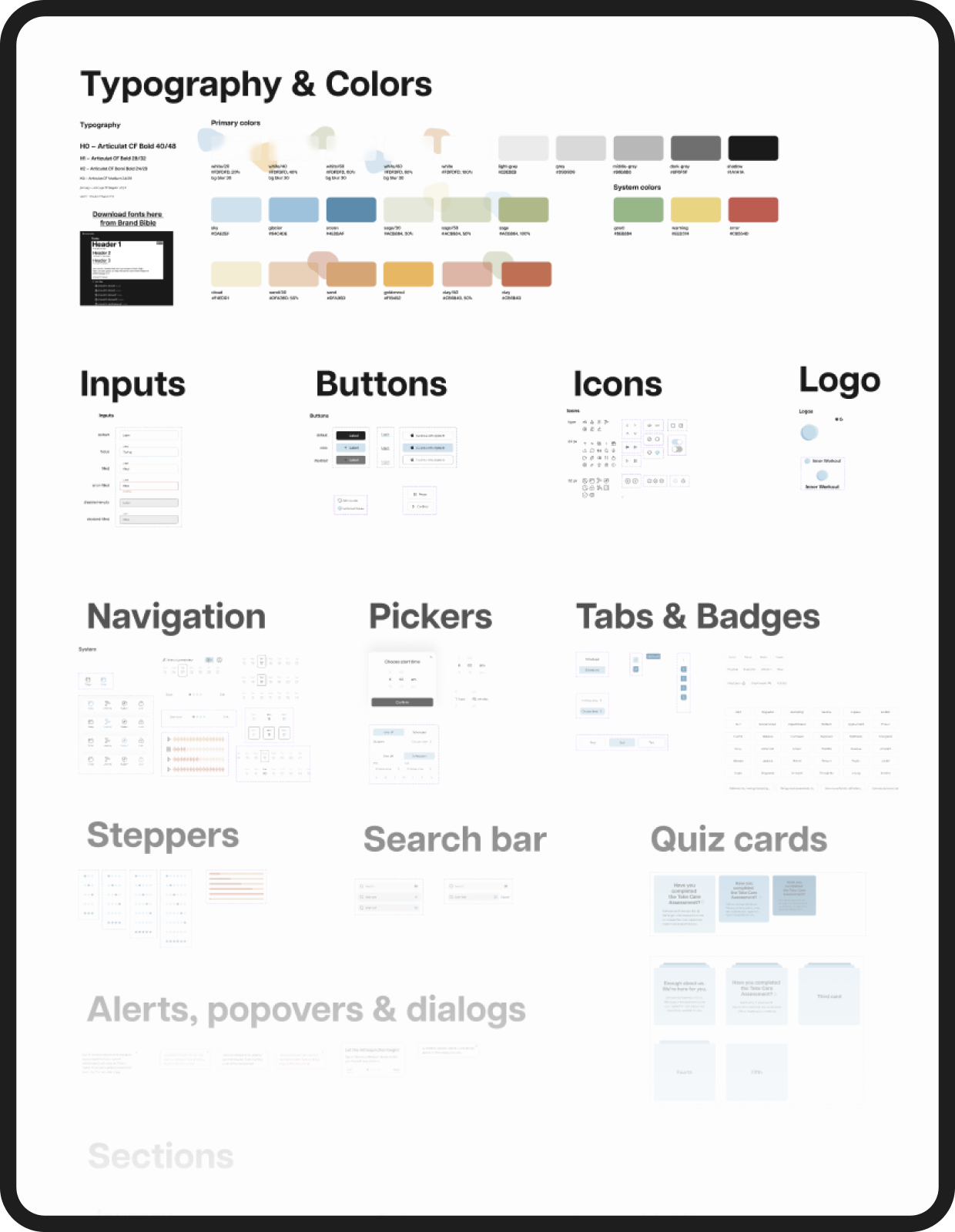
UI Kit
I created UI-kit for developers with all the components (buttons, controls, inputs and others) and their states.
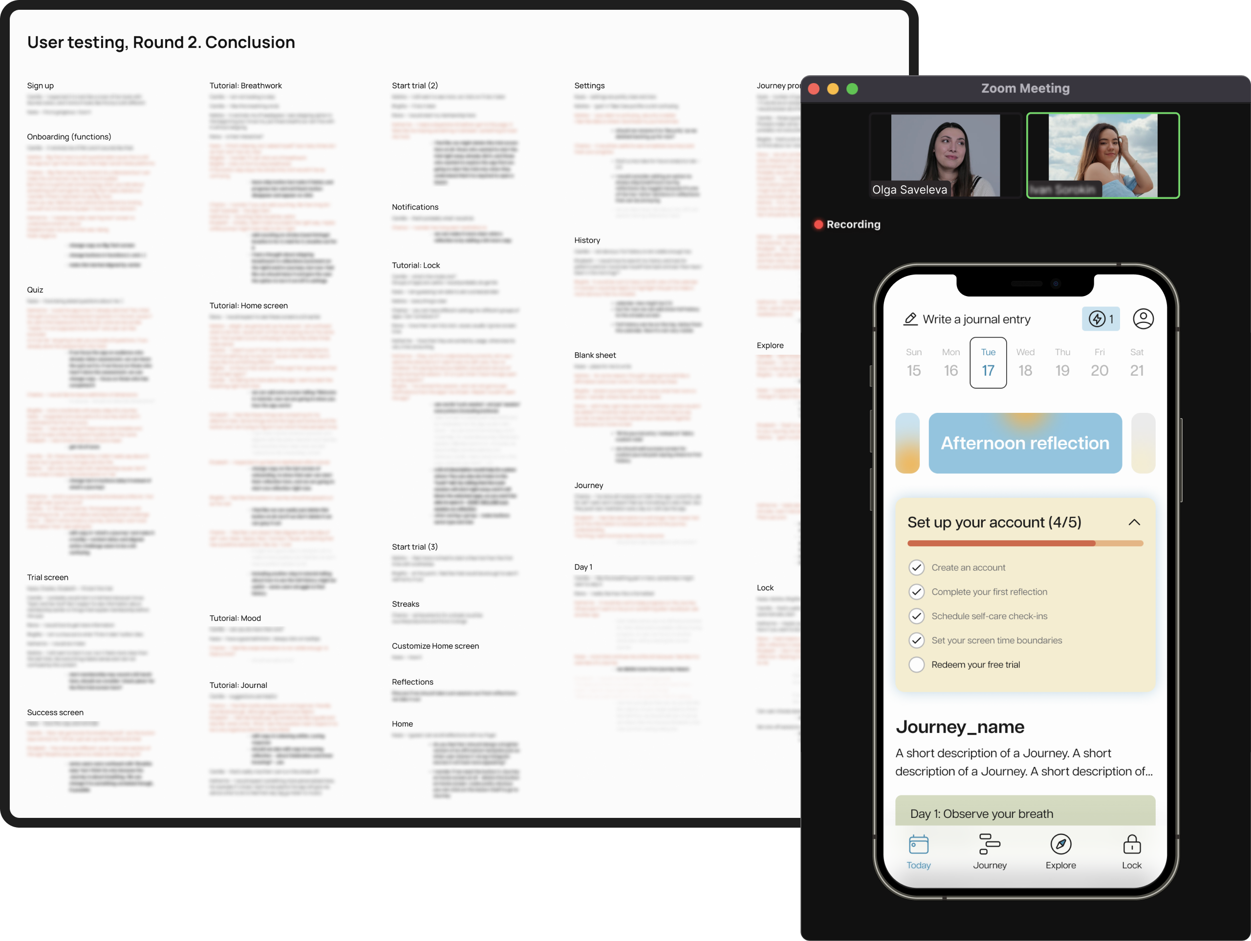
User Testing, Round 2
Gathered feedback from 8 users, discussed it with team and updated the interface according to priority. Some of the insights are postponed for 2.0 version of the app.

